 |
The Evolution of a Department Logo
|
 |
On January 1 1999, the six (or five and a half) university departments
TDB,
CSD,
DoCS,
HCI,
SysCon and
CB were all collected under the common
roof of the new super-department of Information Technology (simply
IT). Among other things, this department
needed a logo of its own. Rather than hiring a professional designer, it
was decided to let anyone who was interested have a go at it. At the
beginning of February the department announced a contest. We had one month to
figure out a good design.
I turned in a few suggestions (all variations of the letters "I" and "T"), but didn't think much of my chances. Much to my surprise,
I actually won -- together with another contestant. Neither of our
entries were good enough. However, they had sufficient potential that the
judges ruled that we should combine them. A logo with the best elements of
both would probably do. Below is a step-by-step account of the design process
that followed.
  |
The twisted and nearly incomprehensible shape to the left is my winning
entry and the straighforward i-t combination on a black square was designed
by Erik Borälv at HCI.
We needed something that had the clarity of Erik's
version without losing the flow and exotic look of mine. It should have
a background, we were told, of the same red-pink-orange color as the
buildings in the area.
|
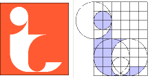 |
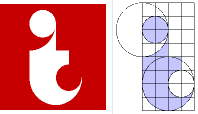
I decided to base the new version on a more rigidly ordered structure. It
had to be easy to reproduce, especially in case we needed a PostScript version.
Three big circles and two small ones combined with a square grid pattern
formed this attempt. Outside it I put an orange rectangle with a thin black
border. I was quite pleased with this design, initially.
| |
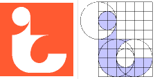 |
But the Powers That Be did not like it. They thought the "t" was hard to
make out and that the bottom middle part was too thin. In addition, they
wanted the bar of the "t" to be less pointy, we could skip the border and
the rectangle should be a perfect square.
I tried a relatively simple adjustment -- moving the second small circle
up one unit and filling in some more of the bend.
| |
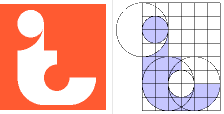 |
At first I was very reluctant to alter the bar. If I made it blunt, the
resulting figure would have very little in common with my winning entry
above. But I tried it nonetheless, just to see what it would look like.
Not surprisingly, it made the "t" too dominant compared to the "i".
| |
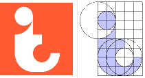 |
There was, however, an easy fix. I moved the bottom right big circle
a little to the left and reduced the thickness of the bend. This alternative
felt promising and a lot less heavy and clumsy than its predecessor.
But now the bend reminded too much of a "c". That might cause a bit of
confusion.
| |
 |
As I scribbled some more on a piece of paper, it occurred to me -- why not
go for the ultimate simplicity? I could skip the third circle altogether
and just use two pairs of circles. One basic shape, copied and inverted (with
just a tiny alteration), formed a symbol that was both an obvious "i" and
a "t" at the same time.
|
Oh, and I was told to change the orange color. For printing purposes it
was decided we should go with the same dark red as the official
Uppsala University logo.
|


