 |
Cross Section: Layout
|
 |
What you've seen in the browser window is not a single chunk. I decided to
split the game up into three parts.
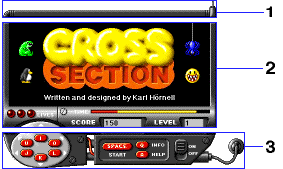
- First there is the top, which is just a GIF.
- Then there is the actual applet. It basically covers the parts that
need updating -- playing area, life indicators, timer, score and level
displays.
- Finally, there is the bottom, which is another GIF.
The main reason I did this is that it allowed me greater flexibility when
designing the control panel. Java applets don't have transparency, so
there is no way of combining rounded corners with web page background
patterns. GIF images can have transparency, however, so it
made sense to keep the non-rectangular parts plain GIFs. (An old trick
but nevertheless worth recommending.)
Another reason is that I could then make the applet area smaller, which makes
graphics updates quicker and more efficient. Oh, and note that
I've put the "seams" mainly where there were already sharp contours. That's
because the image renderings inside and outside applets don't always
match. Sometimes the applet will dither images considerably, while the
browser won't. This approach makes the effect less disturbing.
|


|


